There’s no denying that every eCommerce business owner craves for their store to be a selling one. So, if something can be done to the website to help boost sales, it’s worth the investment. In this article, you can find out which things can be added or improved on a retail site to increase revenues.
1. Proper Categorization, Hierarchy & Menu
Site navigation is the first point worth noting. Ideally, it should be very easy for a user to find his way around the website, allocate items that they’re searching for, either with the use of the search bar and filters or just by clicking through intuitively. For these reasons, properly categorizing products, having a smart and simple hierarchy, as well as a minimal and efficient top menu is crucial.
Moreover, all the mentioned above is vital for every single website layout that you have. It’s considered taboo to not have an optimized mobile version of an eCommerce site or application since a very large portion of purchases is made from smartphones and other non-desktop devices. This is also the reason why so many eCommerce businesses are aiming to build progressive web applications for their store. PWAs are a convenient replacement for native applications, they’re fast, don’t need to be downloaded straight to the device, they are intuitive, have amazing navigation, among other benefits.
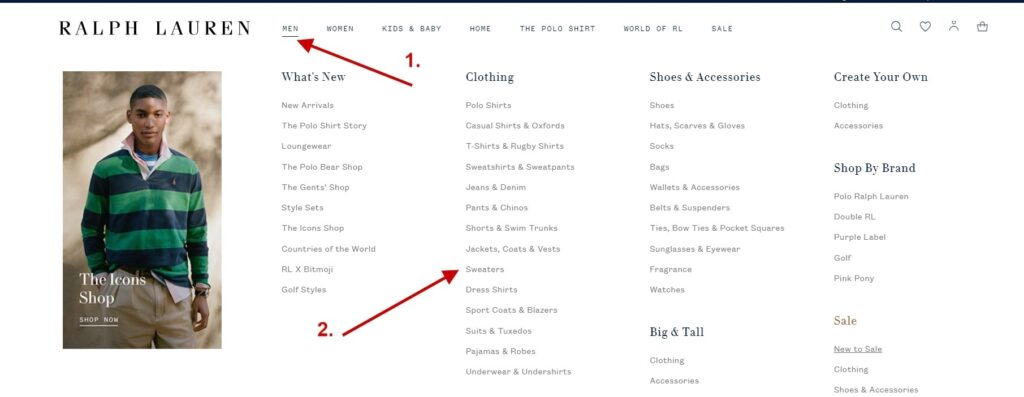
To back up what adequate categorization should be like, let’s take a look at the screenshot of the menu of the official Ralph Lauren website. Although there is a very big variety of products on sale, everything is split very logically. As such, the user can find a product in just a couple of clicks from the top menu.
2. Personalization
Treating clients in an indiscriminate way is a very big mislook. Every person’s shopping experience should matter, and ideally the whole journey should be wrapped around their preferences and tastes. That said, even if you have many website visitors, focusing on your communication and highlighting what they may like is a great way to go.
A few words about communication. When you craft messages for your eCommerce store, keep in mind that one single pair of eyes who’ll be reading it on the other end. For starters, use the so-called “you” approach and address just one client, this helps to make it nice with your potential buyers and form a dialogue of some sort.
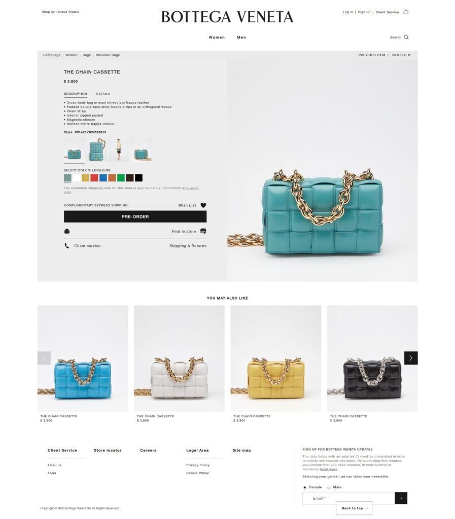
And, mentioning the elements that make shopping personal, sections that collect items that this specific client may like are a “must-have”. Such functionality analyzes the browsing behavior and earlier purchases and pitches products that can be a good match. If that’s done correctly, your prospects can add on more things to their shopping cart and order.
Take a look at the official Bottega Veneta website. As you can see, the “You may also like” block that’s placed on the product page offers similar handbag options that a person can consider buying.
3. Client Reviews
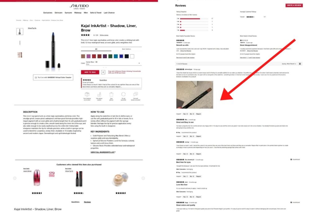
It’s hard to deny the fact that the opinions of other people greatly influence decisions. Similarly, in eCommerce, users tend to rely a lot on the testimonials of those who have already purchased the browsed product, learning about its ups and downs “hands-on” prior to adding the item to their cart. Therefore, give such reviews elements special consideration.
Here’s a screenshot that was taken on the official Shiseido website. Did you notice how much space the Reviews section occupies on the page? Customers can share their opinions on the product, give it a rating, and even upload their own photographs. Plus, there’s a review overview that summarizes all the opinions before the individual comments for helping to draw conclusions faster.
4. Well-Fitted & SEO-Optimized Product Pages
Product pages are the place where your shoppers spend most of their time on your website. Everything must be perfect, at least do your best to achieve that. Here are the major points to note.
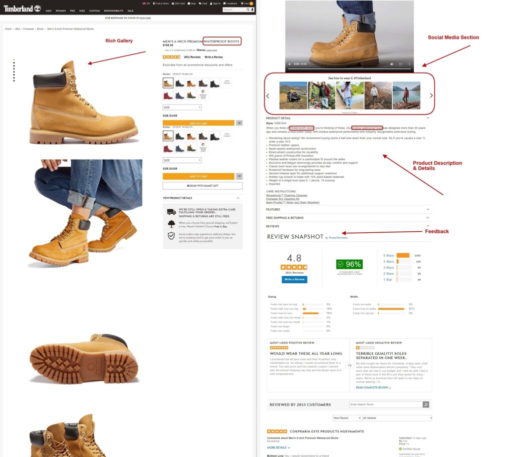
- Titles and SEO. Your products need to be findable not only directly on your website. In an ideal case scenario, your individual product pages should each be climbing up their positions in the search results of search engines. To reach that, you should properly research, use, and distribute keywords on the page. This’ll include the page title and name, the subheadings, description, meta-information, alt texts of images, etc.
- Images. Pictures are immensely important, thus, your gallery should take up a decent percentage of product page space, have pictures of great quality, and can even be supplemented by videos or other technology (such as virtual try-on).
- Descriptions. Any texts that describe your product, its details, and features should be given attention individually. Yes, there may be two very similar items on sale, but their descriptions shouldn’t be duplicated and must be valuable. Remember, you may know the product vertically and across but your clients don’t, help them find out.
Now let’s take a look at an example that features many of the aforementioned points. As seen on the screenshot from the official Timberland website, the gallery has many high-quality pictures, the variations of the product are well-presented. The title contains a keyword, so does the description. The details on the product are rich, there’s a handy size guide. We can also see a video block and reviews. Importantly, there’s even a user-generated content section, collecting social media posts of other customers with the product, such “See how to wear it” sections are very handy for inspiring clients, building trust, and growing the number of followers on social media accounts of the eCommerce business.
5. Gift-Hunting Sections
Looking for gifts is usually difficult. This is why many eCommerce stores devote entire sections of their websites to gifts so that the hunt for ideal presents becomes a breeze.
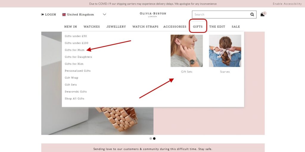
By the way, if you use SEO properly, you can even rank pages with gift suggestions, say, for different recipients. For example, a page that collects great things to give to mothers can be a handy “landing” for those who are searching for such presents.
Case in point, this is a caption of the gifts menu tab of the official Olivia Burton website. There are several selections on offer, including presents based on the budget, the person who’ll be receiving the gift, sets, and even packaging (gift-wrapping) options.
On a separate note, “gift clues” are one more popular element. Such buttons are frequently placed on product pages. They help the user who’s browsing the item to forward the page link to someone as a suggestion of what they wouldn’t mind getting as a present.
The bottom line is that if your online retail sphere implies gifts, then consider adding the content, categories, and functionality that can be mutually beneficial for those who’ll be giving presents, getting them, and for you (as you could be selling more thanks to it).
6. Wishlists & Customer Retention Programs
The sixth point is devoted to two elements: wishlists and various loyalty program sections. Let’s start with the “Saved Items” first. Wishlists are necessary as not all customers are ready to buy straight away. It’s in your interest to allow them to collect liked items for buying later on. Importantly, provide this opportunity without forcing the person to login to your store. Moreover, if you occasionally send the customer a discount or some deal on the item that they’ve liked, you can retain your buyers.
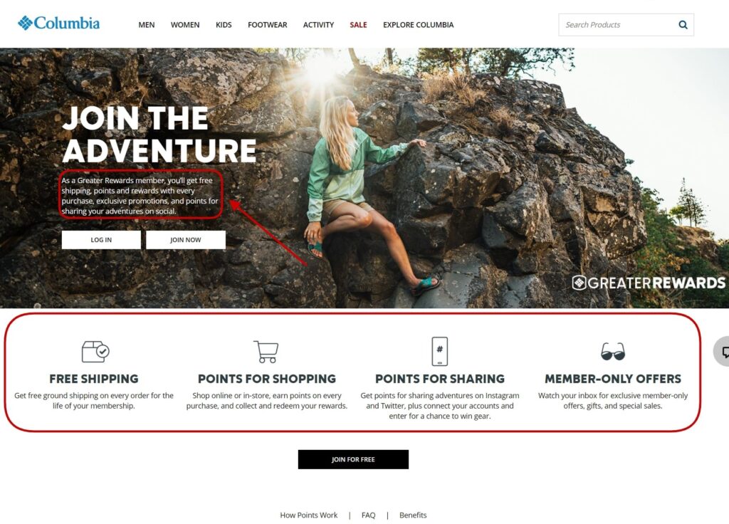
Speaking of returning buyers, it’s widely known that it’s much easier to sell again to an existing customer than to convince a new one to buy. Loyalty programs with various rewards and special terms are a goldmine for retention. As an example, here’s the Rewards program presented on the official Columbia website. Those who have joined the program can enjoy free shipping and other perks based on earned points.
7. Simple Checkout
Finally, the last point that must make the list regards the store’s checkout. In essence, the process needs to be very time-saving and simple. Generally, multiple-tab steps are narrowed down to just one that contains only the actually needed parts.
For this reason, if fields aren’t obligatory, “chop” them away without regret. Long quest-like procedures of buying a product that users often come across result in fell through deals. So why lose clients who abandon their carts when you can make it easy for them to buy what they want?
To avoid other common cart abandonment issues, be transparent with price formation as the last thing you want to do is frustrate your client by popping-in some hidden fee when they’ve already settled for the initial price. Therefore, if there’s a tax or additional something that needs paying for, be clear about it right away.
Lastly, consider expanding your choice lists for payment and shipping methods. This is mainly needed for not disappointing the customer and providing them with the opportunity to pay in the way they like and pick up or receive their order too.
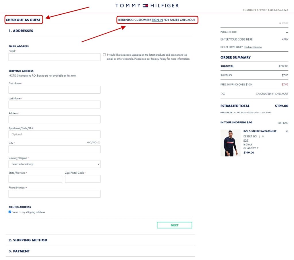
To provide an example of a simple yet efficient product checkout, below you can see how the one used on the official Tommy Hilfiger website looks like. Among the strong things to point out here apart from the layout and a minimum number of fields is that the website allows guest checkout (meaning that the user isn’t forced to sign up for the website to complete a purchase).
Wrapping Up
To conclude, it’s important to not relax your efforts and just stop on what’s been achieved. Remember that there’s always room for improvement when it comes to your eCommerce website and the money it can bring you. We hope you’ve found the tips given in this article handy!
Alex Husar, CTO at Onilab with 8+ years of experience in Magento and Salesforce development services. He graduated from the Czech Technical University and obtained a bachelor’s degree in Computer Software Engineering. Alex’s expertise includes both full-stack dev skills and a strong ability to provide project-critical guidance to the whole team.

