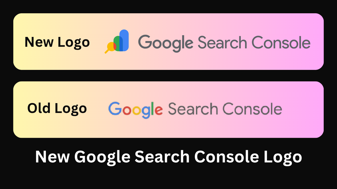
Google quietly rolled out a brand-new logo for Google Search Console, and if you’ve logged in recently, you’ve probably spotted it. Gone is the familiar toolbox icon. In its place? A colorful, modern graphic that blends a magnifying glass and bar chart — the perfect metaphor for performance insights.
Want to download the new logo (or keep the old one for throwback vibes)? You’re in the right place. Grab SVG, PNG, and JPG formats below — no watermark, no fuss.
🆕 First, Here’s the New Google Search Console Logo
This new design reflects what Search Console actually does: helps you track site performance and fix SEO issues.
It’s modern, lightweight, and fully in line with Google’s latest brand style — colorful, friendly, and built for clarity across screens.
🎯 Official Google Statement:
“The toolbox icon served us for a long time, but it’s time for a new design. A bar chart represents growth, and the magnifying glass highlights analysis — all in the fun, colorful style of the Google brand.”
🧰 Miss the Old Icon? Here’s the Classic Toolbox Logo

Some of us still have a soft spot for the old wrench-inside-a-browser icon. It screamed Webmaster Tools. If you’re nostalgic — or documenting a before/after — we’ve got that one too, in high quality.
🔽 Download Both Logos (Free, High-Quality, Multiple Formats)
| Logo | Format | Link |
|---|---|---|
| New Logo | SVG (vector) | ✅ Best for web & print |
| PNG (transparent) | ✅ Great for docs & blogs | |
| JPG (white background) | ✅ Lightweight for email headers | |
| Old Logo | SVG (vector) | ✅ Perfect for history / comparison |
| PNG & JPG | ✅ Great for blog posts, design examples |
Need help converting SVGs? Use svgexport.io or Figma to export into JPG or PNG instantly.
🤔 Why Did Google Change the Search Console Logo?
Here’s the quick breakdown:
| 🔧 Old Logo | 🔍 New Logo |
|---|---|
| Looked like a toolbox (literal) | Shows data + insights (strategic) |
| Outdated “Webmaster Tools” vibe | Modern look matching Google Analytics & Ads |
| Mostly grey/blue | Uses full Google color palette |
| Meant for developers | Appeals to SEOs, marketers, publishers |
Google is repositioning Search Console to be more accessible, data-focused, and growth-oriented. And the new icon reflects that shift perfectly.
✨ How to Use the Logo in Your Projects
| Use Case | Best Format | Notes |
|---|---|---|
| Blog post / article | PNG (transparent) | Uploads fast, no editing needed |
| Presentation deck | SVG or PNG | Sharp on all screens |
| App icon / UI | SVG | Scales beautifully |
| Print report | SVG > PDF | Keeps resolution intact |
💡 Pro Tip: Always use the correct alt text for accessibility — e.g., "Google Search Console logo".
🚀 Final Thoughts
This isn’t just a cosmetic change. The new logo signals a deeper evolution in how Google wants us to think about Search Console — less like a “toolbox” and more like a performance dashboard for serious growth.
So whether you’re updating your blog visuals, rebranding your SOPs, or just keeping your icon collection fresh, now’s the perfect time to swap it out.
🙋♂️ FAQ – Quick Answers
Can I still use the old logo?
Yes — as long as you’re not violating Google’s brand usage guidelines. It’s great for legacy screenshots, blogs, or tutorials.
When did the new logo go live?
The change rolled out worldwide on July 21, 2025, and it’s now live in Search Console and browser favicons.
Can I customize the logo?
Nope — always keep the proportions, colors, and layout intact. Google’s logos are trademarked.

The Search Engine Cage team is on a mission to educate entrepreneurs. We make things easier for the small business owner, by writing articles that help them to understand SEO and Digital Marketing.


